Friday, 18 January 2013
Evaluation Question 4
This project relied a lot on technology. When using media technologies in this project I considered carefully how I could present my different blog post to make visually interesting instead of having large blocks of texts consistently. Instead I found creative solutions to try and present my information in different ways. For example I used Sliderocket to create my audience profile and Prezi to display my evaluation.
The theory of technological determinism affected our project. For example using blogger in order to distribute our rough cut and final music video we had to go through Youtube in order to upload it on there as you couldn't upload straight on their website. However now thinking about it this was probably a good choice to use as it was more globalized and more accessible which increased the interactivity of our audience feedback. Technological determinism also was to my advantage as I had to two professional software. One being Sony Vegas which allowed us to create a professional looking video. And the other being Photoshop which let produced professional designs for my digipak and promotional poster.
Web 2.0 technology was very important in this project. Through Web 2.0 we could directly involve our target audience in the interactivity by inviting them asking for their opinions on rough cuts and my digipak and promotional poster design. YouTube and Facebook were the two main Web 2.0 websites Which I often used throughout the planning, creation and feedback of our video. Using Facebook in creating my print products mean't I could instantly receive feedback from my target audience rather than trying to organise a date to meet up and discuss it which saved a lot of time. We were also able to communicate as a group through Facebook so we could share ideas quickly to each other which helped immensely as we all have different timetables so it was hard to arrange a time we could all get together. Web.20 helped us to share photos and existing videos towards our research and planning which was very helpful towards this project.

Evaluation Question 3
Throughout this project the audience feedback had been vital in creating and developing my products. The audience feedback has been really helpful in helping me come up with creative ideas on how to make my products even better. I gained audience feedback throughout this project during different tasks.
We started getting audience feedback when we presented our pitch so our audience could access our ideas and get a clear picture what our ideas for the music video. The feedback we got overall was positive and our audience seemed to like our concept and our chosen idea for the genre. They did say they were concerned about the weather though as most of our filming would be filmed outside.
Later on at the editing stage we did a rough cut of our music video which we got audience feedback to what we had created so far. To get some new ideas we asked a focus group to check out our rough cut which we asked them questions relating to our video and if they had any suggestions of the development.
 When we created our final cut of the music video I grabbed some last pieces of feedback from my target audience using a program called Skype which I print screened each conversation i had with my audiences. I spoke to them individually rather than a focus group discussion as I thought it was more easier for the target audience to have their say rather than having people talking on top of each other. I asked them similar to questions I asked within my focus group so i could compare to see if the feedback was more positive so I could see if our changes had been successful. Skype allowed my target audience to type freely what they wanted with it being private where they wasn't being interviewed via video. Having Qualitative feedback is more helpful in this project as it lets you have a better understanding on people's opinions rather it generating a number of statistics which doesn't help you with any ideas.


What would I do differently if I was asked to complete this project again?
If i was to do this task again I probably would experiment more with different techniques which one of our target audiences suggested doing. Also I probably would take more time filming the scenes so its smooth, some of our sorts were slightly shaky which didn't look that good, because we were on a strict time scale we were rushed some nights and didn't have time to reshoot that scene. If i was to do this again I would make sure I used a tripod in most of my shots.
This is my feedback of my digipak. From receiving audience feedback for my final product I can see that it has been successful and popular on my audience. I asked them the following questions;
1. Do you think my digipak and advert represent the music video I created well, if so or if not why?
2. Do you think it looks professional?
3. Does it suit my genre of pop/rock, why?
4. Does it appeal to you?
5. Would you change anything to improve them?

My audience feedback thought my print products reflect the mood of the video well and has a clear link, this shows I have been successful at promoting and branding the video. All of my audiences said it looks really professional with a clear house style. They all agreed it suits my genre of pop/rock due to the colour theme and the bold elements and would be something they'd expect to see in the store. Everyone said it appeals to them with a few saying they would even buy it if they saw it on display in a shop which shows the product has done well in the marketing aspect. And finally none of my audiences said any suggestions to improve my print products which tells me its at the highest standard as it can be.
We started getting audience feedback when we presented our pitch so our audience could access our ideas and get a clear picture what our ideas for the music video. The feedback we got overall was positive and our audience seemed to like our concept and our chosen idea for the genre. They did say they were concerned about the weather though as most of our filming would be filmed outside.
Later on at the editing stage we did a rough cut of our music video which we got audience feedback to what we had created so far. To get some new ideas we asked a focus group to check out our rough cut which we asked them questions relating to our video and if they had any suggestions of the development.
We made these changes of our video of what our focus group suggested in our final cut.
When creating my print products I got feedback while I was designing. I created a draft which I put together a Facebook group to get their opinions. I posted font ideas and design ideas which then got commented on.
 When we created our final cut of the music video I grabbed some last pieces of feedback from my target audience using a program called Skype which I print screened each conversation i had with my audiences. I spoke to them individually rather than a focus group discussion as I thought it was more easier for the target audience to have their say rather than having people talking on top of each other. I asked them similar to questions I asked within my focus group so i could compare to see if the feedback was more positive so I could see if our changes had been successful. Skype allowed my target audience to type freely what they wanted with it being private where they wasn't being interviewed via video. Having Qualitative feedback is more helpful in this project as it lets you have a better understanding on people's opinions rather it generating a number of statistics which doesn't help you with any ideas.


From getting feedback for my final cut I can answer the following questions:
How have the audience read the values expressed in your video?
According to the cultural studies approach they are three different ways an audience can view a text, which is preferred, negotiated or oppositional. All of the feedback I got in my feedback for my final cut was preferred which means the audience recognized the determination driven by the soldier and empathy for the fact he lost and just wanted to get home.
Some examples of preferred reading I got were as followed:
"I understand that the person is from a military background and is returning from war. He is trying to find home but cannot remember exactly where it is. After searching the town he finds the correct house with his girlfriend waiting for him."
"the character is sort of on a journey, he's trying to get back home... to the one he loves"
"yeah i understand it. its a soldier coming back from war and not being able to find home."
If our audience read our text in a negotiated or oppositional way they would have either bought in outside influences and opinions (such as relating the media text to their own experiences of someone being in the army) or if the reading was oppositional, they would have disagreed with the storyline base of the video.
What have I learn't from my audience feedback?
I have learn't many things from conducting my feedback for my final cut. I asked my audience six specific questions relating to my video which all included genre, representation, performance and improvement. My feedback was mostly all positive with them giving us great comments about our video. Some of our audience related our videos to other music videos such as rise against and the script which are the same genre as us. It was also apparent that other audiences couldn't relate our video to other music videos which shows our originality of our story line. All of our audiences understood the narrative easily and gave positive comments on how well the performance looked with the lip syncing being spot on. There was an odd criticsm on the drum playing however we found this an issue as we knew no one who could actually play the drums so we had to improvise wish I think we did quite well with considering.
What would I do differently if I was asked to complete this project again?
If i was to do this task again I probably would experiment more with different techniques which one of our target audiences suggested doing. Also I probably would take more time filming the scenes so its smooth, some of our sorts were slightly shaky which didn't look that good, because we were on a strict time scale we were rushed some nights and didn't have time to reshoot that scene. If i was to do this again I would make sure I used a tripod in most of my shots.
This is my feedback of my digipak. From receiving audience feedback for my final product I can see that it has been successful and popular on my audience. I asked them the following questions;
1. Do you think my digipak and advert represent the music video I created well, if so or if not why?
2. Do you think it looks professional?
3. Does it suit my genre of pop/rock, why?
4. Does it appeal to you?
5. Would you change anything to improve them?

Evaluation Question 2
After creating my print products I made a group on Facebook where I invited my target audience to give me feedback on my print products which I posted on the page. My overall feedback was quite positive with only a few minor improvements they suggested adding which helped me develop my final print products. They said the theme of the print products relate well to my genre of pop/rock with me using a common colour theme which is used in this genre. I always asked ideas for what font type would be the best for my genre which my audience chose. They commented on how I have a clear house style between the products which is a convention that every 'real media' product needs to have as you are creating a brand for your artist.
Thursday, 17 January 2013
Evaluation Question 1
In what ways does your media product use, develop or challenge forms and conventions of real media products?
Where have your ideas come from? How were you inspired to do what you did?


 We decided as a group we were going to use the song 'Chasing the moon' by My Future Lies. We all liked this song a lot and was the genre we liked to listen to. When listening to the song we thought of loads of ideas for the story line we could do for our video. I started brainstorming ideas for what the purpose was of a music video. Then I started researching and analysed existing music videos similar to that genre of the song and print work.
There really wasn't a major music video which helped influence our ideas as our concept was different as we didn't focus on binary oppositions eg relationships which tends to happen a lot in this genre, e.g. the script videos. When studying videos I found that most of them had some links between the lyrics and the visuals as stated on Andrew Goodwin's theory and this was a convention we followed. The song 'Hero of war' by Rise Against and the film 'Saving Private Ryan' did help influence our ideas though this video had a slightly different story line to what we have its has a same concept of a soldier in denial and lost who he is. We based our video along the lines of the emotions shown in these videos of the soldier emotionally upset with what he's been through and just wants to find his way home back to his loved one. A main influence in our creativity was creating our mood board which helped us bring our ideas together with different emotions. We were inspired by some lighting choreography by similar bands of our genre, for example Simple Plan's video 'Save You'. The idea of having our main singer involved in both the performance and the narrative was inspired by the script where we looked at their song called 'Nothing'. This wasn't the only song of theres where the artist was involved in the narrative most of their songs did this, the Fray's songs also did the same which told us that this was conventional to do in this genre.


How different are your products to 'real' media products?

To what extent have you been original/how have you used redundancy and entropy?
 Earlier in my blog posts I researched how videos can be redundant or entropic. When analyzing the same music videos of our genre we noticed most of the videos were mostly redundant than entropic which we took into account. However we wanted to add an interesting element into our video. After our intial ideas we decided we wanted to create a emotional journey of a soldier which the audience can emphasise with. This mean't we could include entropy in an redundant plot line which would appeal to our audience. The idea of journey is quite redundant as you can imagine someone walking to get to a specific place which is quite orginal. However we made it entropic by changing the settings and adding little querky things into the video. For example the still shots of the toy soldiers at the start of the video and the little kick the character gave at the end when he got to his home, this adds humour which makes it more interesting than him finally finding
his home which the audience wouldn't expect to happen which makes it entropic.
This is an orginal idea which doesn't normally get used in music videos of our genre.

Where have your ideas come from? How were you inspired to do what you did?


 We decided as a group we were going to use the song 'Chasing the moon' by My Future Lies. We all liked this song a lot and was the genre we liked to listen to. When listening to the song we thought of loads of ideas for the story line we could do for our video. I started brainstorming ideas for what the purpose was of a music video. Then I started researching and analysed existing music videos similar to that genre of the song and print work.
There really wasn't a major music video which helped influence our ideas as our concept was different as we didn't focus on binary oppositions eg relationships which tends to happen a lot in this genre, e.g. the script videos. When studying videos I found that most of them had some links between the lyrics and the visuals as stated on Andrew Goodwin's theory and this was a convention we followed. The song 'Hero of war' by Rise Against and the film 'Saving Private Ryan' did help influence our ideas though this video had a slightly different story line to what we have its has a same concept of a soldier in denial and lost who he is. We based our video along the lines of the emotions shown in these videos of the soldier emotionally upset with what he's been through and just wants to find his way home back to his loved one. A main influence in our creativity was creating our mood board which helped us bring our ideas together with different emotions. We were inspired by some lighting choreography by similar bands of our genre, for example Simple Plan's video 'Save You'. The idea of having our main singer involved in both the performance and the narrative was inspired by the script where we looked at their song called 'Nothing'. This wasn't the only song of theres where the artist was involved in the narrative most of their songs did this, the Fray's songs also did the same which told us that this was conventional to do in this genre.
During the creation of my print work I referenced real media products to my genre to get an insight of what the layout tends to look like and the design of colours etc. I noticed black and white was popular in my genre which i chose to do and from this I think i developed a strong design of my digipak and my poster. Looking at existing similar artists it helped influence me on the individuality of each digipak and how there is a strong link between their theme of their print work to their music video. This had influenced me greatly on the design of my digipak giving me a reference point of where most things should be placed such as the bar code and labeling on an album design.

How did audience research direct your creativity?
Throughout my project I conducted regular target research with my work. I used my target audience for their opinions and feedback for improvements.The main work I got feedback from my target audience was the development of my digipak and advert and the improvements on my rough cut which helped me create my final cut. The audience feedback which was conducted gave us a good insight in what they wanted and affected our editing of the music video as we listened to what they suggested and acted on that. We added more transitions which was suggested by them to create a smoother cut between each clip which made it look more proffesional, they also suggested adding an extra moon clip into our video as we were lacking in having enough scenes of the moon which the whole video was based on 'Chasing the moon' which we took on board and added in. I referred back to my audience profile and my moodboards during the start of my project to keep me on track and tried to keep consistent in my theme throughout the whole process.

How different are your products to 'real' media products?
Our video is very conventional compared to being different to real media products. Our video could be seen as different to other media products as we have a female within our band where you find most bands of this genre tend to be just male. The storyline of our video is quite conventional to our genre where the lyrics match the storyline. The colour theme is also conventional using a popular colour theme of this genre. We got to use the performance lights to enhance our video and experiment with different angles which let us create a more realistic 'media' product as this is conventional in most music videos to enhance the performance but none of this was different to what our genre does.
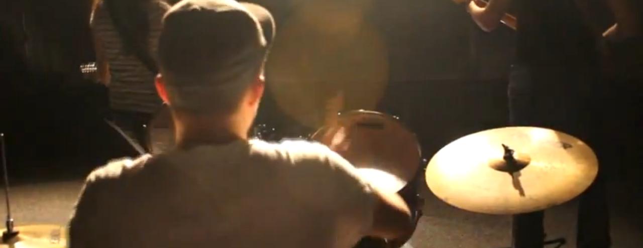
 Earlier in my blog posts I researched how videos can be redundant or entropic. When analyzing the same music videos of our genre we noticed most of the videos were mostly redundant than entropic which we took into account. However we wanted to add an interesting element into our video. After our intial ideas we decided we wanted to create a emotional journey of a soldier which the audience can emphasise with. This mean't we could include entropy in an redundant plot line which would appeal to our audience. The idea of journey is quite redundant as you can imagine someone walking to get to a specific place which is quite orginal. However we made it entropic by changing the settings and adding little querky things into the video. For example the still shots of the toy soldiers at the start of the video and the little kick the character gave at the end when he got to his home, this adds humour which makes it more interesting than him finally finding
his home which the audience wouldn't expect to happen which makes it entropic.
This is an orginal idea which doesn't normally get used in music videos of our genre.

Thursday, 10 January 2013
Final Digipak and Advertisement

After getting some feedback on my digipak the changes I made which was suggested by my target audience was moving the track list to the left side instead of the right, I also added a barcode to my back cover which is conventional of what a CD digipak would have if it was on sale. I also made a few changes myself by adding the music labels logo, the bands website address and copyright information which I saw most CD digipak's had when i was analysing them which made my back cover look more proffesional and more appealing. I also created a design onto my CD to make it visually more appealing which follows the conventions of digipak's.
Most of the feedback stated that there was to much white on the top left image, to improve this I added some text from the band giving thanks which most digipak's contain somewhere in their pack. This got rid of the white space which there was at the top.

I only got one major feedback from my target audience on my advertisement which there was too much white space at the bottom. To improve this I added some star ratings from two music magazines, this made my advertisement look more appealing and more professional. However I decided to make a few changes myself to my advert, I thought about using a different photograph than the one I had before as I used that on my front cover and I wanted to vary my use of different photographs.
Wednesday, 9 January 2013
Time management update
This is an update of what I plan to do in the upcoming weeks where I will be coming to an end of my project


Friday, 28 December 2012


Sunday, 23 December 2012
Production of digipak front cover
I cut each band member out of the photograph I took in my photo shoot and placed them on a new background layer.


Once I had finished cutting out each member of the band I placed them upon the background which I edited earlier on using a process called 'Curves' which allows me to adjust the brightness and contrast of the picture. This resulted in me in having a bright white background which left me with just my tree outline and not the texture in the back.

I then coloured each person in black and white to keep that colour theme of the digipak I had chosen to do and make it look better upon the background.

I then inserted the font which I chose after doing my audience research on which font they thought was most appealing to them.

To finish it off i added the album's title below the bands name and placed an arrow beneath the bands title to give it an extra touch.

This was my final results

Wednesday, 19 December 2012
Fonts


Wednesday, 12 December 2012
Digipak template

Final Cut
This is our final cut we have made after we got some audience feedback. We took on board what our audience said and have made changes to what they have suggested. We have added more transitions between shot so it is more smoother.We also added another shot of the moon in the chorus, we didn't want to add a moon to every chorus as it would be to repetitive. However what we have down is added a moon shot on one of a performance shots of the chorus.
Friday, 7 December 2012
Editing Update

CD Album Cover (Digipack) Analysis: Green Day - Bullet in a Bible
Front Cover

The front cover is very redundant and conventional for that genre of rock. It will appeal to their target audience as the cinematography is done at a low angle of the main singer with a back shot of him looking at the crowd which gives it that concert atmosphere and feel to the album which connotes that its live music which would attract their target audience as its the common thing they like to do in their spare time. This reinforces the star image as they are dominating the crowd which shows his importance and value amongst their fans which links in with Goodwin's theory of promoting the artist.
Their target audience will recognize the band as they have used their housestyle font which was used on all of their other albums. Their font style is very block style which most albums tend to use as its easy to read and very simple. They have their own unique style though which their target audience will recognize as being them as it tends to always be in white with it standing our on a vivid background (mostly black and red).
The colour scheme choice is very lively and striking, this lets you easily see the artist and the bands name with it being very graphic. The band name and album name is both in the same colour and is placed underneath one another. The bands name is slightly in bigger font because that is the name their target audience will know already rather than the album name.
Inside

The inside of this digipak they have 3 panels whereas i will only have 2 when i come to designing mine. The left panel just consists of a side shot at a low angle of a band member. This follows the theme to what the front cover was like and keeps that theme of the genre and the live music which will appeal to their target audience. The colour scheme is still consistent with it being red and black. The fact that hes playing with a guitar will attract their target audience because it connotes to live music as hes playing it right there where most albums will tend to just have a photoshoot with them having no instruments.
The middle panel contains their DVD track which has footage of their live music. This links in with the whole album and adds an extra feature which their target audiences will like. The disc has the main singer singing which denotes that this is a live show. Whereas the studio disc just has a shot of the whole band without any instruments or singing. Behind the disc is a red and black texture which adds a good effect with the disc on top.
The right panel is the main album disc where its their studio songs, you can tell this because its made for them to look cool and all about their posture, with it being done through a photoshoot. This is because they want to promote the band and make them look more appealing. The same background is used on both disc panels which keeps that consistency and continuity to the album. It also states what songs are in the studio album which is highlighted in red writing.
Back Cover
.jpg)
The back cover again consists of a red background which been used constantly throughout the album's design. The images are at a slight angle which was is following the same layout as the bands name of the front cover which is keeping to their recurring style. The crowd is now facing towards the viewer where they are more visible than the front. This will appeal to their target audience as it makes them want to be apart of the concert. Above the crowd there is different pictures of the band playing, this adds movement to the album which makes it feel more lively. The band members show a lot of emotion which is conventional to this genre when playing music, one of the pictures the band member is pulling a funny face which adds humour and shows their characteristics with it showing their a down to earth person which would appeal to their target audience.
The track list is placed upon a red background with the font writing being white which is used throughout the album. The font size is quite small but is easily seen as the contrast is very powerful. The barcode is placed at the bottom right corner which is conventional for a album to have. Along with this they have along the bottom the CD's formats and the bands website and record labels. This will appeal to the target audience as they are given access to find information on the record label of the band as well.
CD Album Cover (Digipack) Analysis: The Script - #3
Front Cover

The front cover is very unique and grabs your interest straight away with its entropic look. The main singer has a side view of his face with the other band members inside his head which looks really cool. This challenges the conventions of this genre as this genre tends to just have a long shot of the band but this band have decided to conjoin them all into one head. The band have managed to reinforce the star image in a different layout which would appeal to their target audience as its unusual which the band would normally have on their album cover which connotes maybe a different style within their songs in this album. This links in with Andrew Goodwin's theory of the demands of the record label, a close up of the band is used on the front cover which is unique.
Their house style of the name of the band is used on the front cover as used on all their other albums so their target audience will recognize its them. Their font size is very distinctive and with it having a very different style than just having a block style texts which many albums use.
The colour scheme is very simple with just black and white. Because the background is white behind it, it makes the main band look very visible with the vivid contrast. The band title and album name is also the same colour and placed either side so its easily seen and separated apart. To fill the empty white spaces they have also added stickers like including the 'Hall Of Fame' soundtrack which will appeal to their target audience as it was a number one hit which will be included into their album.
Inside

The right side of the inside is again a shot of the band, however its an extreme long shot. They are keeping their colour scheme consistent. Their posture is very conventional of this genre which will appeal to their target audience. Also their clothing is very casual which will appeal to their target audience.
Back Cover

The back cover style links in with their front cover. However the groups faces have changed around, so the main singer is now staring directly at the audience which splits up the outline of the head which was on the front cover. This could connote to the emotions of their album songs which their songs based along a honest tale of break up that channels melancholy, anger, despair, false hope and then, finally, admittance.
The track list has a very small font size and is placed in the top right corner. Even though its small its very visible as they placed it in a different colour than the main white background which makes it stand out a lot but doesn't ruin the bands main image which is the focus. The bands website is placed in the bottom right corner along with the bar code and the music label it was distributed by which will appeal to their target audience as they can find out extra information, this follows the conventions of CD albums.
CD Album Cover (Digipack) Analysis: Simple Plan - Get Your Heart On
Front Cover

Inside

The left side of the inside is very unique, it is written in a handwritten font so it seems personal which would appeal to their target audience as it feels like its written by the band personally. The writing contains some of their songs for example their song called 'Gone to soon' with it having the lyrics of the song underneath it, this layout challenges the conventions of this genre but reinforces the band as it seems like they have gone the extra mile for their fans by having something personal which they would like.
The right side of the inside is again in handwritten font so it keeps that consistency of making it personal for their audience. Instead of having the song lyrics they have put all the songs on their with it having like credits underneath of who it was written by, who edited it, and published it etc. This is different and makes it more visually interesting to look at which would appeal to their audience.
Back Cover


The front cover is slightly different to what a normal pop/rock artist would have. Instead of having the band on the front cover they have laid it out that a fan is looking at their new album in a magazine. This is unique and doesn't follow the conventions of this genre. They have reinforced their band through someone else, with them having posters of them also all over their room which is quite appealing as it shows their popular which will appeal to their target audience, this might connote that they like having a close relationship with their fans with it being featured upon them. This also links in with Goodwin's theory of having an intertexual reference to media which in this case is magazines and posters.
Their house style of the name of the band is used on the front cover so their target audience will automatically recognize them. Their font style is block style which is very simple and easy to read, this is a common convention in this genre. The font has been placed upon a white background so you can easily see it though the font size is small. The album title is used in a different colour which separates them both out from each other.
Theres a sticker on the front as part as a feature which is there to attract their target audience. It includes information about two popular songs of theirs which is in their album. They said 'To get your heart racing', this links in with the album title. This will be appealing to their audience as it persuades them to buy it in order to listen to that good song, with it having a bonus track.

The right side of the inside is again in handwritten font so it keeps that consistency of making it personal for their audience. Instead of having the song lyrics they have put all the songs on their with it having like credits underneath of who it was written by, who edited it, and published it etc. This is different and makes it more visually interesting to look at which would appeal to their audience.
Back Cover
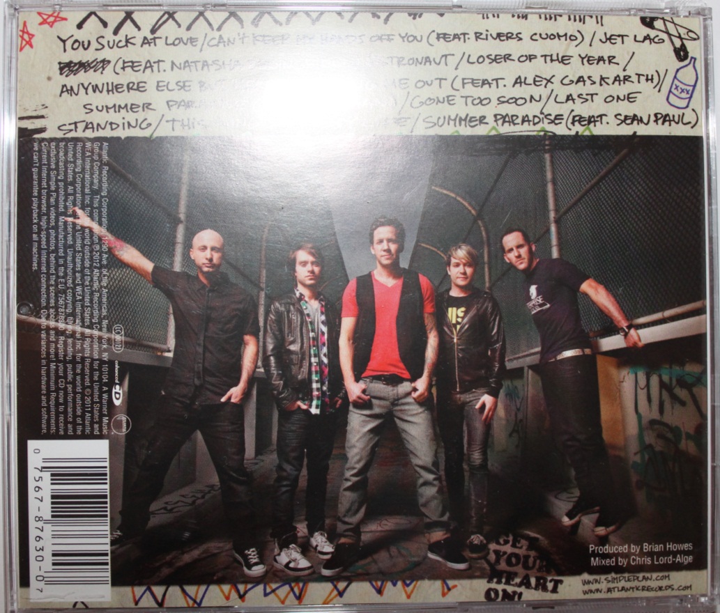
The back cover features a long shot of the whole band on the front. This is a different layout than most artists would tend to do it where they would have the band featured on the front first so they are promoting their selves straight away linking with Andrew Goodwin's theory. However the characteristics of this whole album design seems to be personal and handwritten towards the fans which is why they have a fan on the front cover which is linking to their style as being the main attraction and the focus of the album.
The track list is kept in the handwritten font to keep the consistent style of the album. The font size is quite small so the main focus is the band which is used to promote them which is a common convention of what an album needs to include. The track list is still very vivid though as its got a good contrast with it being very visible against the background.
The bar code is placed on the right hand side at a 90 degrees angle which normally a CD tends to be placed at the bottom right, this makes you focus even more on the band itself with the bar code being out the way of their view. It also states the bands website and the record labels website so that the fan can access more information if they wish which would appeal to them if they want to know extra information about the band or maybe even their record label.
CD Album Cover (Digipack) Analysis: 'The Kooks - Inside In Inside Out'
Front cover

The font used is very simple and easy to read with it having a block style. This draws the audience more into the image first and then to read the text easily. The colour of the band name is highlighted in a different colour than the album name which separates them both out into different points. They both stand out well due to it being on a white background which is a very good contrast.
Inside

The left side of the inside shows a monochrome image of the band again, which keeps the continuity of the band CD theme. Above the image on the top there is a section where the band gives thanks to people which will appeal to their target audience as its addressed to people like them. There is also a red strip going across the band's faces with the word 'Out'. This colour and word relates to the title of the CD album which keeps the recurring colour scheme
The ride side of the inside features film strips of the band which are again monochrome with a slight bit of red in the corner. The images show the band messing around which is a common conventions of young youth which would appeal to their target audience, it also shows the characteristics of the band which will attract their target audience as they will see them as being fun.
Back Cover

The back of the front cover features another monochrome long shot image of the band which is slightly blurred. These images links well with the overall theme of images in the CD which keeps the consistency and style going of the album.
The track list is placed on the left side with it being quite small in size. As the main image is very vivid the track list isn't very visible and eye catching. The font however is still kept black with it having a simple style which makes it easy to read and not completely out of the picture.
The bar code is placed at the top right hand corner with it also stating the bands website. This allows their target audience to easily find out more information if they wanted to when they buy the CD.
CD Album Advert Analysis: Coldplay 'X&Y'

This advert is separated into two parts.
The first part we clearly see to start with the whole band image. This is the
most important element for the record label, as one of Andrews theory was “The
demands of the record label will include the needs for lots of close ups of the
artist". This is not a close up of the band but it does however follow the
principle of using an image of the band so that the target audience will recognize
them and hence be interested into the advert. The band members are also staring
direct at the viewer so the audience might feel more connected.
The second part contains information about
the album so the audience can get the information they need in order to buy the
item. The title of the band is the most important as its in bold along with the
title of the album. The release date is also in large font size but is not in
bold but still is very eye catching. It stands out a lot more due to it having
a black background so it will stick out to the audience straight away. It also
features the cover of the album next to it which I might do for mine because
if you have an image of the album cover it makes it easier for the audience to
recognize and find it rather than have to research in it, so they could purchase
it quicker.
It also gives the website address at the
bottom so that their audience can research them and get more information about
their songs. It also displays the name of the record label which is EMI, this
will give their target audience more recognition and take more interest as the
record label is very professional.
Finally the colour scheme connotes to a metallic
and techno feel to the album especially when you can see the front cover being
a simple deign which you wouldn't connote for being a rock album which is
strange as it is. It indicates to the audience that they might be trying a new approach
and therefore will be interested in seeing what it’s like and might be more
appealing to them as its different to what they normally do.
CD Album Advert Analysis: Stereophonics 'Keep Calm and Carry On'

The size of the advert is about a full
page, it uses the same image as used on their album front cover so people will recognize
the CD which keeps that continuity. The image takes up the whole advert and is
the most primary element as its trying to spread a message across to its
audience. The title of the album ‘Keep calm and carry on’ is connoted through
their use of imagery where the band is eating breakfast in the sea which makes
it entropic and relates to the title well. The background of the colour is grey
which is quite depressing. The colour gray connotes feelings of repentance and
contemplation which suggests the
album relates to the mood of grief and sadness which in some ways is
conventional for their genre of rock as people tend to have a lot of emotions
with this genre.
The font used in this advert is Arial. This
is a neutral and friendly font to use, the type- face is suitable to attract
the audience of a younger era of rock. The advert contains the release date and
details of the album at the bottom of the advert. The release date is emphasized
as it has a slightly bigger font size. The title of the band appear to always
be first like a newspaper would, this make sure you promoting the artist
straight away to your audience.
The layout is very simple and to the point,
which would attract their audience as it’s easy to follow, the colours are
simple and straightforward which is very redundant in album advertisement as
they don’t want to overload their target audience.
Subscribe to:
Posts (Atom)