Friday, 7 December 2012

CD Album Cover (Digipack) Analysis: Simple Plan - Get Your Heart On

Front Cover

The front cover is slightly different to what a normal pop/rock artist would have. Instead of having the band on the front cover they have laid it out that a fan is looking at their new album in a magazine. This is unique and doesn't follow the conventions of this genre. They have reinforced their band through someone else, with them having posters of them also all over their room which is quite appealing as it shows their popular which will appeal to their target audience, this might connote that they like having a close relationship with their fans with it being featured upon them. This also links in with Goodwin's theory of having an intertexual reference to media which in this case is magazines and posters.

Their house style of the name of the band is used on the front cover so their target audience will automatically recognize them. Their font style is block style which is very simple and easy to read, this is a common convention in this genre. The font has been placed upon a white background so you can easily see it though the font size is small. The album title is used in a different colour which separates them both out from each other.

Theres a sticker on the front as part as a feature which is there to attract their target audience. It includes information about two popular songs of theirs which is in their album. They said 'To get your heart racing', this links in with the album title. This will be appealing to their audience as it persuades them to buy it in order to listen to that good song, with it having a bonus track.

 Inside

The left side of the inside is very unique, it is written in a handwritten font so it seems personal which would appeal to their target audience as it feels like its written by the band personally. The writing contains some of their songs for example their song called 'Gone to soon' with it having the lyrics of the song underneath it, this layout challenges the conventions of this genre but reinforces the band as it seems like they have gone the extra mile for their fans by having something personal which they would like.

The right side of the inside is again in handwritten font so it keeps that consistency of making it personal for their audience. Instead of having the song lyrics they have put all the songs on their with it having like credits underneath of who it was written by, who edited it, and published it etc. This is different and makes it more visually interesting to look at which would appeal to their audience.

Back Cover
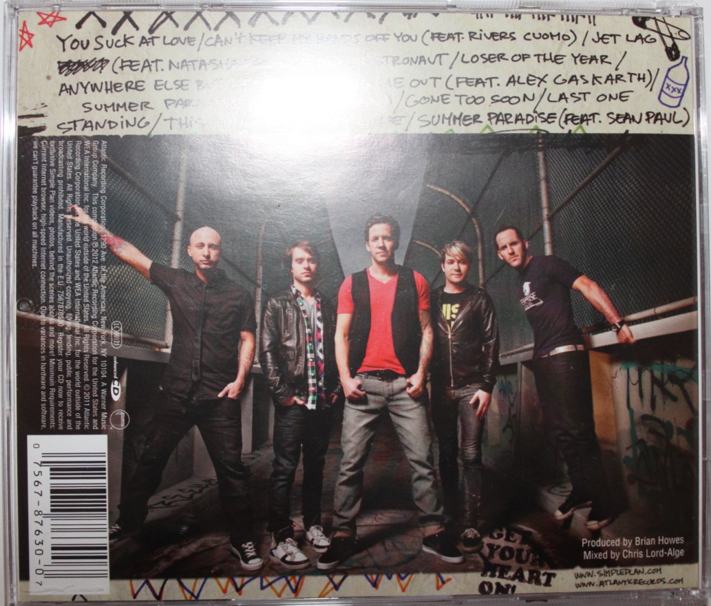
The back cover features a long shot of the whole band on the front. This is a different layout than most artists would tend to do it where they would have the band featured on the front first so they are promoting their selves straight away linking with Andrew Goodwin's theory. However the characteristics of this whole album design seems to be personal and handwritten towards the fans which is why they have a fan on the front cover which is linking to their style as being the main attraction and the focus of the album.

The track list is kept in the handwritten font to keep the consistent style of the album. The font size is quite small so the main focus is the band which is used to promote them which is a common convention of what an album needs to include. The track list is still very vivid though as its got a good contrast with it being very visible against the background.

The bar code is placed on the right hand side at a 90 degrees angle which normally a CD tends to be placed at the bottom right, this makes you focus even more on the band itself with the bar code being out the way of their view. It also states the bands website and the record labels website so that the fan can access more information if they wish which would appeal to them if they want to know extra information about the band or maybe even their record label.

CD Album Cover (Digipack) Analysis: 'The Kooks - Inside In Inside Out'

Front cover
The main image of the front cover is very simple with the band members being a picture of them in monochrome at long shot of them playing guitars. This could connote the band is very laid back and chilled which creates an enigma and relatable to the target audience. The costume the band is wearing is very casual, this again emphasis the characteristics of the band and the feeling that they are laid back as a band which will appeal to their target audience being young. The use of their guitars as their props connotes the type of music genre the band relate to which will appeal to their target audience. This links in with Andrew Goodwin's theory of an artist having certain genre characteristics which would attract their audience as its the same characteristics as them.

The font used is very simple and easy to read with it having a block style. This draws the audience more into the image first and then to read the text easily. The colour of the band name is highlighted in a different colour than the album name which separates them both out into different points. They both stand out well due to it being on a white background which is a very good contrast.

Inside
The left side of the inside shows a monochrome image of the band again, which keeps the continuity of the band CD theme. Above the image on the top there is a section where the band gives thanks to people which will appeal to their target audience as its addressed to people like them. There is also a red strip going across the band's faces with the word 'Out'. This colour and word relates to the title of the CD album which keeps the recurring colour scheme

The ride side of the inside features film strips of the band which are again monochrome with a slight bit of red in the corner. The images show the band messing around which is a common conventions of young youth which would appeal to their target audience, it also shows the characteristics of the band which will attract their target audience as they will see them as being fun.

Back Cover
The back of the front cover features another monochrome long shot image of the band which is slightly blurred. These images links well with the overall theme of images in the CD which keeps the consistency and style going of the album.

The track list is placed on the left side with it being quite small in size. As the main image is very vivid the track list isn't very visible and eye catching. The font however is still kept black with it having a simple style which makes it easy to read and not completely out of the picture.

The bar code is placed at the top right hand corner with it also stating the bands website. This allows their target audience to easily find out more information if they wanted to when they buy the CD.

CD Album Advert Analysis: Coldplay 'X&Y'


This advert is separated into two parts. The first part we clearly see to start with the whole band image. This is the most important element for the record label, as one of Andrews theory was “The demands of the record label will include the needs for lots of close ups of the artist". This is not a close up of the band but it does however follow the principle of using an image of the band so that the target audience will recognize them and hence be interested into the advert. The band members are also staring direct at the viewer so the audience might feel more connected.

The second part contains information about the album so the audience can get the information they need in order to buy the item. The title of the band is the most important as its in bold along with the title of the album. The release date is also in large font size but is not in bold but still is very eye catching. It stands out a lot more due to it having a black background so it will stick out to the audience straight away. It also features the cover of the album next to it which I might do for mine because if you have an image of the album cover it makes it easier for the audience to recognize and find it rather than have to research in it, so they could purchase it quicker.

It also gives the website address at the bottom so that their audience can research them and get more information about their songs. It also displays the name of the record label which is EMI, this will give their target audience more recognition and take more interest as the record label is very professional.

Finally the colour scheme connotes to a metallic and techno feel to the album especially when you can see the front cover being a simple deign which you wouldn't connote for being a rock album which is strange as it is. It indicates to the audience that they might be trying a new approach and therefore will be interested in seeing what it’s like and might be more appealing to them as its different to what they normally do.

CD Album Advert Analysis: Stereophonics 'Keep Calm and Carry On'


The size of the advert is about a full page, it uses the same image as used on their album front cover so people will recognize the CD which keeps that continuity. The image takes up the whole advert and is the most primary element as its trying to spread a message across to its audience. The title of the album ‘Keep calm and carry on’ is connoted through their use of imagery where the band is eating breakfast in the sea which makes it entropic and relates to the title well. The background of the colour is grey which is quite depressing. The colour gray connotes feelings of repentance and contemplation which suggests the album relates to the mood of grief and sadness which in some ways is conventional for their genre of rock as people tend to have a lot of emotions with this genre.

The font used in this advert is Arial. This is a neutral and friendly font to use, the type- face is suitable to attract the audience of a younger era of rock. The advert contains the release date and details of the album at the bottom of the advert. The release date is emphasized as it has a slightly bigger font size. The title of the band appear to always be first like a newspaper would, this make sure you promoting the artist straight away to your audience.

The layout is very simple and to the point, which would attract their audience as it’s easy to follow, the colours are simple and straightforward which is very redundant in album advertisement as they don’t want to overload their target audience.

CD Album Advert Analysis: Florence + The Machine - 'Lungs'


One convention I've noticed with this album advert is that they have used the same picture as the CD album front cover so the audience will identify it in shop when its released. As before the image takes up the whole page of the advert so the colour scheme comes from that. Because the artist is placed upon a black background it allows the artist to be the focus of the advert which will attract their audience as its stands out easily. This meets the need to promote the artist which was said in Goodwin's theory, it also keeps the recurring motif style this artist uses so their target audience will recongnize it.

The font used for the advert is like a handwritten style which will relate to their female target audience as its very feminine. The title of the album is a bigger size font than the other information which grabs your attention first. This structure allows you then to see the information underneath. The contrast of the colours of having white writing stands out on a black back ground which makes it eye catching. The dark tonal colours links to their genre of older teens and young adults.

The text tells the audience that specific popular songs are on the album; this is a way to persuade her audience to buy the CD. It also features their website address so they can create a link between the band and their target audiences to search for them.

Thursday, 6 December 2012

Focus Group


We organised a focus group in order to get some feedback about our music video. We got our focus group be be balanced by getting two females and two males so we have a balanced view.

We asked the following questions;
- Is our video appropriate for our genre and why?

- Do you think our balance between performance and narrative effective?

- Does the music video appeal to you and why?

-Is the main singer someone you can be friends with and get along with?

-Is there anything you would change or improve on?

Most of our video was quite positive overall with a few suggestions on how we could improve. Our target audience said they think its appropriate for our genre which means we have been successful in our video. They said we have a excellent balance of performance and narrative and appeals to them. They also said that the singer looks like someone they can be friends with as he looks a cool guy and obviously is very caring as hes walking home just to reach his girlfriend.

From our audience feedback that the video we have decided we need to add more moon footage into our video as our audience brought to our attention we only displayed the moon twice within the video. We will change this as we agree that we need more footage added in because afterall our title is 'Chasing the moon'.

We have also decided after the feedback we need to make our video more smoother in between cuts, we  plan to do this by adding more transitions in between clips to make it look more professional.

Audience Feedback - Facebook Group

We created a Facebook group to get some audience feedback. We uploaded our rough cut into the group so that the members could watch the video before answering the questions.                                                                                                                                                            

The questions were:

- Is our video appropriate for the genre? And why?

- Do you think our balance between performance and narrative is effective? Or what could we change with that?

- Does the music video appeal to you and why?

- Is the main singer someone you could be friends with and why?

- Is there anything you would change or improve on?


All of the comments we received were positive where everyone said it links well with our genre and was very appropriate


Everyone said our balance between performance and narrative was perfect and we balanced it just right


Everyone seem to like our video and it appealed with them with most of them liking the storyline which they thought was very effective and interesting and makes you want to know what happens.


Everyone said the main singer seemed friendly and cool which they could be friends with which shows we are appealing to our target audience


Finally mostly everyone said we didn't need to improve on anything. One person suggested one thing which was more emotion and power from the band. We plan to research this further and create a focus group to get more discussion into our video.